Showing posts with label Editing. Show all posts

Thursday, August 26, 2010

Hanging Out for Love That Shot

Thursday's is Love That Shot's Link Up day. They ask that you share your photo plus tips on how you took it, edited it, whatever!

Here is one of my faves from the past week. This is K's newest trick - hanging on the swing, She loves to twist it around and kick her heels up. She loves that she doesn't need anyone to push her. I love that part too because I can just sit back and shoot.
SOOC:

SS: 1/400, Ap: F/2.5, ISO 400, 50mm

This is nearing sunset, with the sun probably dipped behind trees/clouds at this point. I am loving that the sun is setting so much earlier right now. It is usually in that golden hour in the hour before K's bedtime. perfect!
What I like about this was  the composition - she is in a strong rule of thirds position, there is little to no distraction around or behind her. I feel like bench acts as a nice leading line too, even though its part of the bokeh.
It looks a bit cool to me though.

Here is my edit:
I just brightened and increased contrast overall using curves. Then I went into the blue channel and pulled some of the blue out. I wish her pants wouldn't go so neon, but I again, I am so not good at the masking/layers game to know how to brighten the whole photo without this happening. This happens whenever I have pink in a photo. And with a baby girl, that is pretty much everyday. meh.

What shot do you love from this week? Come share them here:

Tuesday, August 24, 2010

Editing Then and Now, Plus Flower Challenge

I was scouring some photos for the most recent Paper Mama Challenge and decided to try my hand at re-editing a photo I took in March. I liked the results and so thought I would share with you dear friends.
I have always stuck to the analogy that in photo editing, less is more, and the best thing to do is get the greatest shot as possible SOOC (straight out of the camera). Photoshop is a beautiful thing, but its also a lot of responsibility. When we first get our hands on it, we tend to go overboard - heavy vignettes, over saturation, oompa loompa babies. the works! As time passes, we train our eyes, and our editing style will change (we all hope!).
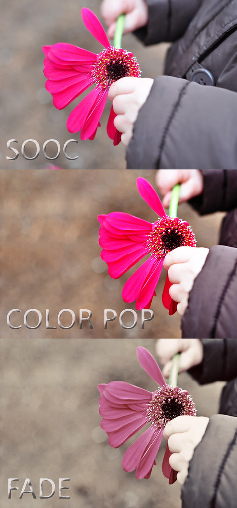
So as an example, here is a photo I took in March, my original edit back then, and my new edit now

Original:
SS: 1/125, Ap: f/2.8, ISO 200, 50mm
Now I blew the highlights in this, big time. The flower is practically 3D, the reds are so clipped. Notice the hotspots on her hands and pants. Its also really cool.

Back in March, this is all I did:
basically I cropped and probably brightened the midtones a bit (which it totally doesn't need)

And this is the edit I just did:
 I was able to tone down the highlights, and play more with the individual colour channels (red, green, blue) to get the ground and her skin to a more natural colour, plus tone down the flower some. It is still clipped, and ideally I would like to recover it even more, but my masking/layering skillz are so not ready for that.

Back in March, you can see what two editing gurus were able to do with a few other shots from this same session here. I am not there yet, but I feel like I am getting closer. Baby steps, baby steps.

Hope that was helpful for some. With all that said, I am also entering the last photo in Paper Mama's current challenge, which is Flower. Check it out here for other "sweet" shots:
The Paper Mama

Wednesday, April 14, 2010

Bounty of Black and White

I went for a walk yesterday through the park and took my camera with me, determined to get my creative juices flowing again. I was struck by alot of the "architecture" of the outdoors. Plus I was on the lookout for some "letters" to add to my alphabet gallery. For most of them, it seemed to suit a black and white conversion. What do you think? Are these overprocessed/overblown and/or muddy? Are any just not interesting?

A park bench:

Swing set, aka my letter "U":

a funky dome structure - looking straight up

a steel trellis, aka my letter "X"

and the crook of a tree to represent my "V":

Saturday, March 20, 2010

Gerber Daisies

The Photoboard picture of the week challenge this week was Pink. I got what I thought was a really fun picture of Keira with a gerber daisy to submit. I also decided to shoot the daisy itself and practice my close-up / focus work. I cropped slightly, adjusted levels and ran an unsharp mask for viewing.
Photo Stats:
Exposure Time:0.0062s (1/160)
Aperture:f/2.8
ISO:200
Focal Length:50mm (75mm in 35mm)

and for fun, when editing in GIMP, I tried an auto white balance to see what happened. I think Andy Warhol called and wants his flower back.

Friday, March 19, 2010

Extreme Makeover, Photo Edition

There are some uber talented ladies on the photo message board I frequent. We often take a stab at editing each other's stuff, when someone is bored, stumped or in my case, clueless.

I was really excited by a series of shots I got last night with K and a pink gerber. I grapple with editing because I have gotten to the point where I notice when something is SOOC, and I want to give it that extra oomph. But let's face it, I have no leet skillz in that area yet. I am still trying to learn the adage, "less is more". I also don't want to rely on editing to save crappy photos, but merely to make great photos amazing. So I never know how to handle my own stuff. Not to mention I don't have access to all the fun photoshop "actions' available out there (a pre-set group of settings you can instantly apply to photos for a desired affect).

When a few people requested some shots to work on today, I jumped at the chance to see what they would do.

First up was Kari of Kari Merkel Photography. She is the master of B&W conversions, and also has a clean, crisp style in her day to day shooting I really envy. For her blog and full rundown of her steps, go here

I love it! I never know if I can pull off the faded look, but here, I really like the vintage ethos it brings, and how it brings more attention to her little hands because the colour of the flower isn't so overpowering.

Next up we have Ashley of Ramblings and Photos. She is a resident editing expert. Her edits bring clarity and sophistication to the shots. She also tolerates all of us kid-crazy MWACs (moms with a camera) when we post about our kids 90% of the time.
For her blog and full rundown of her steps, go here
::dies:: Look at K's eyes! Again, she used a slightly faded action which helps to tone down the colour of the flower and return some of the focus to my baby. And who doesn't love all the attention to be on their baby?

thank you ladies. I feel like an aging starlet who stumbled across the right makeup artist to help transform me to my former glory just in time for the Oscars :)

Tuesday, February 9, 2010

Day 029: contemplative Simon

 
Nothing very exciting. Just my first baby checking out the world. This colour cast came out very purply red. not sure why. Probably forgot to reset the white balance after yesterday's challenge
  
desaturated and then brightened with curves. May still be a little grey though, especially in the eyes. But going any brighter seems to blow out his fur. Perhaps I should try to pop just the eyes? Keeping it colour was distracting me because of all the random things behind him (floor, cord, ottoman)
Photo Stats:
SS 1/20
Aperture f/5
ISO 400
Focal Length 55mm
taken with flash and lightscoop

Wednesday, January 27, 2010

Day 027

This is a very belated shout-out and thank you to my secret elfster, Peeper.

She sent me the gift for someone who has everything - all the wishes in the world :)
Thank you Peeper. I have been ripping off each ticket and writing my wish across the back, hoping it will come true. I plan to look back on them once they are all done and see what my wishes brought me this year.


SOOC
 

Edit
Cropped, played with the curves to pop the colours, cloned out a few dirty spots and then ran an unsharp mask, which is definitely my newest favourite thing.

Photo Stats:
SS 1/15
Aperture f/5
ISO 400
Focal Length 50mm

Tuesday, January 26, 2010

Day 026

Just a little practice for Valentine's Day:

SOOC
Ack! super dark. I forgot to bump my ISO up before taking the shot. Then I probably could have bumped my SS too. Not a huge deal since it wasn't a moving target, but I really need to get in the habit of checking all 3 settings.

auto white balance, curves adjustment in GIMP

I would have preferred the background to go more white. it is still too blue. I also have a crease in the cardboard I was using and I couldn't figure out how to blur it out. Any suggestions on either of these?
Ideally, I should have sat the stool further away so the background blurred properly, and then that wouldn't have to be fixed in post. Live and learn.

Photo Stats:
Shutter Speed: 1/8
Aperture: f5.0
ISO: 200
Focal Length: 50mm
Flash & Lightscoop

Note: this was fully manual setting, finally!

Monday, January 25, 2010

Day 023


SOOC

One of my personal challenges for the year is to create my own photograph alphabet. Here is my first letter - S!

cropped, desaturated and increased contrast in GIMP

What do you think of this edit? Does it help or hinder the photo?
Photo Stats:
Shutter Speed: 1/200
Aperture f5/6
ISO 800
Focal Length 100mm

Sunday, January 17, 2010

Day 015


 SOOC

 In the middle of a very dreary rain forecast, the sun made a miraculous 3 hour appearance. I hopped down to Granville Island on my lunch break and snapped some shots. The angle is a bit off; but otherwise I am pretty happy with this one.

 
Just upped the saturation and contrast a bit in GIMP.
Anyone notice my mad photoshopping skillz?
Photo Stats:
Exposure 1/250
Aperture f10
ISO 125
Focal Length 42mm


Day 013


So I realized that its kind of pointless for me to only post edited shots. How can I learn if I don't compare the SOOC (straight out of the camera) ones and get feedback on that? The goal is to get as perfect a picture as possible before the editing process. Not to mention my editing hand needs to get "softer". I have a tendency to overdo colour saturation. So I would love feedback going forward on what you think of the original composition, aperture/SS/ISO choices and also the editing.


Photo Stats:
Exposure .0769s (I have never seen it listed this way before. what does it mean???)
Aperture f5.3
ISO 800
Focal Length: 69mm

messed with the colour curve a bit in GIMP. I think I may prefer the SOOC though. I tried to whiten it up, but now I think some of the hot spots on her skin look yellow. WDYT?

Saturday, January 2, 2010

Day 002

K started to run a horrific fever this morning. When the forehead strip jumped immediately to 40 degrees +, I think my heart skipped a few beats. She basically slept on either R or I all day, waking briefly to breastfeed or moan incoherently. Thankfully it did come down before bed and she was almost back to her normal mischievious self. So, I didn't get a chance to work on my "hands" photo (a request to help a fellow nestie who is currently recovering from several strokes). Hopefully tomorrow before the deadline. I think I have a good idea that hasn't been posted yet!

In the meantime, here is what my life consisted of today:


I should have had the tylenol on the right so the 3 items were balanced better. Live and learn. Also, my bathroom has green walls so I tried to balance the white using the curves feature in GIMP, as the auto white balance still looked really green to me. Not sure I succeeded.

Photo stats:
Exposure: 1/6
Aperture: f5.6
ISO: 400
Focal Length: 86mm